Risk vs Return Chart 2007 – 2009
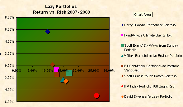
Here is a chart that sort of goes with the previous posting’s table. I have taken just a few of the portfolios of interest and computed their standard deviation for the time period of three years. Then plotted their ANNUALIZED return on the Y axis vs. their annualized standard deviation along the X axis.
Remember that you’d want your portfolio to be at the top left of the chart because their you get the higher return with the lower risk.

So for the three year period from 2007 through 2009 the Harry Browne Permanent Portfolio showed the best return and the least risk of any of the featured lazy portfolios. More analysis to come…

 Join us on Facebook
 Follow us on Twitter