How to get an accurate investment graph
A tale of two graphs -or-
Don’t believe everything you see
I’ll talk some more about this on show 65. But a caller wanted to know how to compare the performance of his ETF that pays dividends against other investments. The charts lie, basically. Yahoo Finance and other charts are dumb and just plot the stock’s price. They don’t take into account reinvested dividends to give a more accurate representation of the investment’s performance in your portfolio.
Fortunately, StockCharts.com’s PerfChart comes to the rescue. See the difference on the Vanguard REIT ETF (VNQ) below:
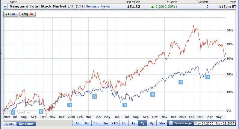
This is the Yahoo Finance chart showing the gain in the STOCK PRICE ONLY.
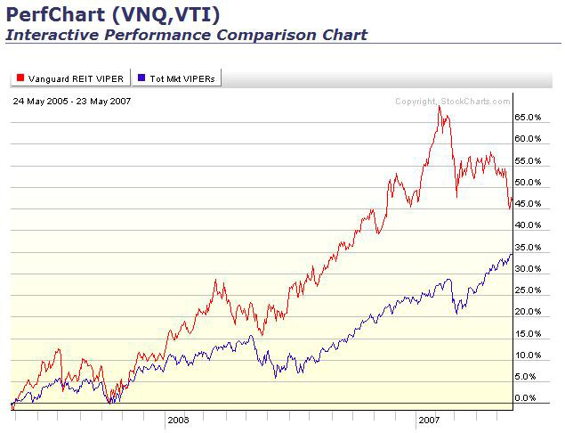
This is the StockCharts.com PerfChart showing the gain in the INVESTMENT including reinvested dividends.
Anyone know of another stock chart site that gives the correct chart?

 Join us on Facebook
 Follow us on Twitter