Max Drawdown in Lazy Portfolios 2001 – 2009
Instead of using Standard Deviation as the measure of a portfolio’s risk, I have been looking at using Max Drawdown which I believed could be more user-friendly. Standard Deviation involves complicated statistical computations. Could you explain Standard Deviation to your grandmother? Max Drawdown would be easier to explain. It is the largest peak to trough drop in a portfolio, measured in percentage. For example, if the largest drop of a portfolio during a studied time period was from $100,000 to $60,000, that would be a Max Drawdown of 40% for that time period.
Recently, I have been computing the Max Drawdown of the many Lazy Portfolios. I modified Simba’s spreadsheet to include monthly returns data instead of just yearly data because a portfolio could suffer drawdown within the year and recover before the end of the year, thus masking the fact that a larger drawdown occurred.
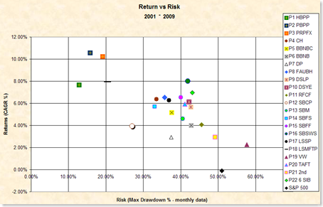
The following chart shows the Annualized Returns vs. Monthly Max Drawdown for several Lazy Portfolios from the beginning of 2001 through the end of 2009. (I am in the process of renumbering the Lazy Portfolios, so this post does not correlate with previous posts. See the Appendix for portfolio names.)
Figure 1: Annualized Return vs. Monthly Max Drawdown 2001 – 2009. Click it for a larger chart. See the full legend below.
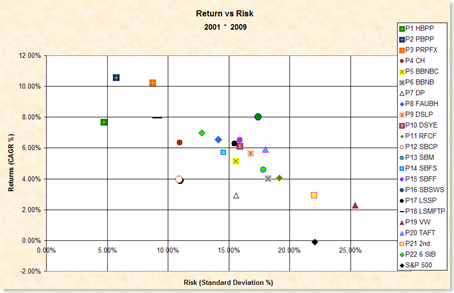
This next figure is the more traditional chart showing Annualized Returns vs Annualized Standard Deviation in percent.
Figure 2: Annualized Return vs Annualized Standard Deviation 2001 – 2009. Click it for a larger chart. See the full legend below.
The ideal location of a portfolio’s plot point would be at the top left of either chart.
I was really surprised that these two charts looked so similar. Most of the Lazy Portfolios are in the same relative location on both charts. There are some small variations for select plots, but overall the chart looks the same. The biggest part of my surprise is that the Max Drawdown chart used monthly data and the Standard Deviation chart used only end of year data. Specifically, the Max Drawdown chart used 83 sample points while the Standard Deviation chart used only 9. The similarity of the charts gives me confidence that using Standard Deviation as a measure of risk is appropriate for evaluating the relative performance vs. risk of the Lazy Portfolios.
However, in terms of human understandability, I like Max Drawdown better because one can immediately apply the number to their own situation. It is simply a matter of multiplying one’s portfolio value by the Max Drawdown percentage. For example, for a peak portfolio value of $100,000 invested in the PBPP, the Max Drawdown during the period was about $15,000. That number is understandable. It also is easy to compare the Max Drawdown of PBPP to the Max Drawdown of the Rick Ferri Core Four portfolio, for example, which dropped about $45,000.
The problem with Max Drawdown is that computing it requires many more sample points to get the actual value. I had previously computed Max Drawdown using only year-end values. When I did that, the Max Drawdown of the PBPP was only 0.5% compared to about 15% for using month-end values. It turns out that the PBPP dropped about 15% in 2008 but recovered most of it before the end of the year. Even so, Obviously we would need daily values to get the true maximum number. Even so, a chart of Max Drawdown using only year-end values showed the same relationship between the Lazy Portfolio plot points.
Max Drawdown is an easier risk number to comprehend than standard deviation. But it is more difficult to compute. And the relationship between the portfolios’ risk remains largely the same.
Appendix
The following table lists the legend key for each plotted Lazy Portfolio along with its full name.
| Legend Key | Portfolio Name |
| P1 HBPP | Harry Browne Permanent Portfolio |
| P2 PBPP | Paul Boyer Permanent Portfolio |
| P3 PRPFX | Permanent Portfolio Mutual Fund |
| P4 CH | Bill Schultheis Coffee House |
| P5 BBNBC | Bill Berstein No Brainer Cowards |
| P6 BBNB | Bill Berstein No Brainer |
| P7 DP | Dilbert’s Portfolio |
| P8 FAUBH | FundAdvice Ultimate Buy & Hold |
| P9 DSLP | David Swenson Lazy Portfolio |
| P10 DSYE | David Swenson Yale Endowment |
| P11 RFCF | Rick Ferri Core Four |
| P12 SBCP | Scott Burns Couch Portfolio |
| P13 SBM | Scott Burns Margaritaville |
| P14 SBFS | Scott Burns Four Square |
| P15 SBFF | Scott Burns Five Fold |
| P16 SBSWS | Scott Burns Six Ways from Sunday |
| P17 LSSP | Larry Swedroe Simple Portfolio |
| P18 LSMFTP | Larry Swedroe Minimize FatTails Portfolio |
| P19 VW | Vanguard Windsor |
| P20 TAFT | Ted Aronson Family Taxable |
| P21 2nd | 2nd Grader |
| P22 6 SIB | Six Core Asset Index Funds Strategic Asset Allocation Moderate |
| S&P 500 | Standard & Poors 500 Index |
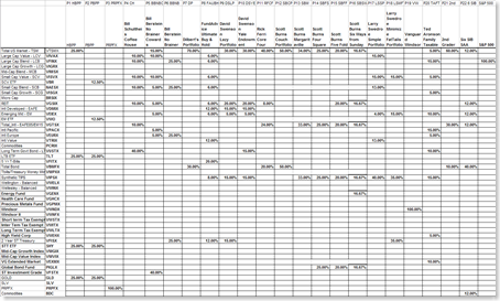
Here is the spreadsheet of each portfolio’s holdings. Click to make it readable. Someday I will update this web site to show the contents of each of these Lazy Portfolios in HTML format.
Data is from Yahoo! Finance historical adjusted returns. Actual data used where possible. Data prior to inception for VBR used VISVX, VWO used VEIEX, TLT used VUSTX, GLD used gold, SHY used VFISX. The data and the resulting analysis may contain errors. Invest at your own risk.


