Technical Analysis and Trend Following
I have a question for you trend followers. You chart watchers. You technical traders. Have a look at this chart and tell me if it is time to buy or time to sell.
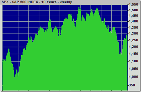
Looks like the momentum is up on this baby right? Time to buy? Here’s how it worked out for you…
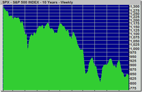
The first chart was from roughly May 1998 thru April 2001. The second chart was from about April 2001 thru March 2003. The trend definitely wasn’t your friend if you thought we had bottomed in April 2001 and were headed for nothing but up.
Now take a look at this chart:
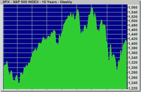
Anything familiar-looking about this chart? Is it the same chart as the top one?
Nope. This chart is from April 2006 to present. For everyone who says we’ve seen the bottom. Revisit chart #2.
I wish I’d never seen a stock chart and I wish I didn’t have easy access to charts like I do now because I get sucked in to thinking that there must be patterns in prices like there are patterns in nature. I am always wrong when I think that. Studies have shown that there actually is *some* momentum, but I really don’t think anyone can consistently profit from it. Here’s a better chart if you must look at charts.
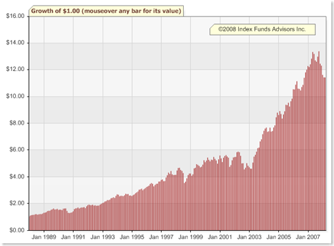
Twenty years of Index Portfolio 100 from IFA.com.
I’m just sayin’. Set it and forget it. For twenty years!

 Join us on Facebook
 Follow us on Twitter